Archeus Back
VISION:
Create an elegant extendable brand for a skincare start up with big dreams.
PATH:
The brainchild of Georgina Langdale, Archeus means ‘life force’ – communicating the purity of the skin care range, which are wisely blended from finest natural ingredients, and the business itself which is focussed on giving back to nature. In many ways Archeus is a catalyst of change and portrays this with its truly holistic business model. A portion of Archeus’ proceeds are directly invested back in plant conservation. A value we LOVE.
OUR PART:
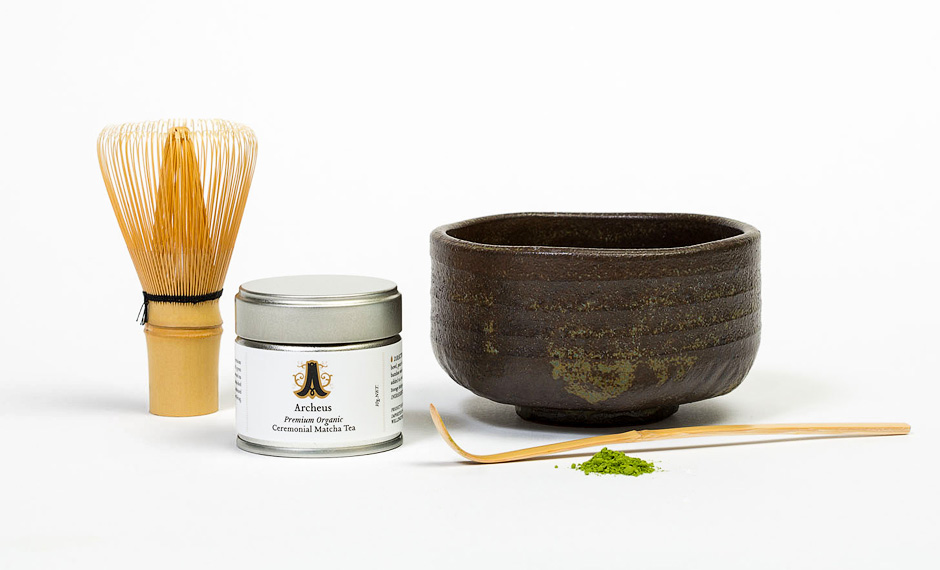
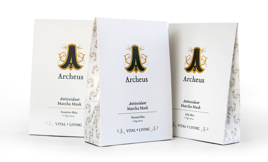
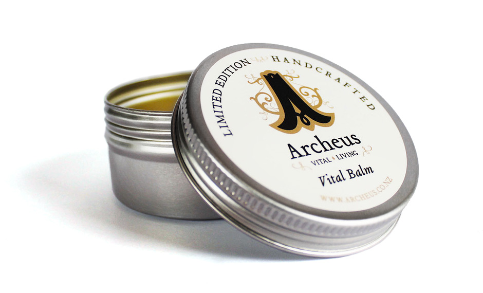
Brand development, Visual ID, Brand application: Packaging, Print materials, Product testing (the best part!)
OUTCOME:
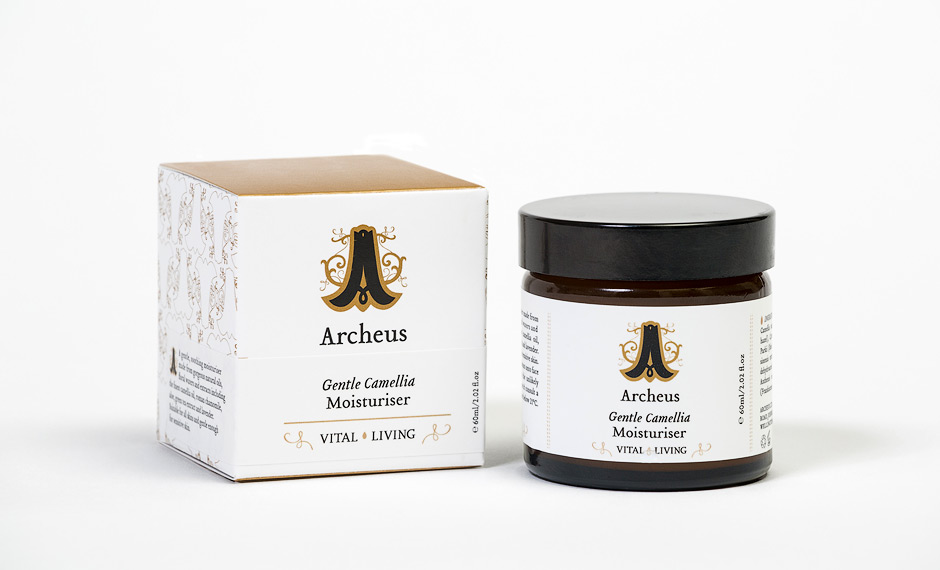
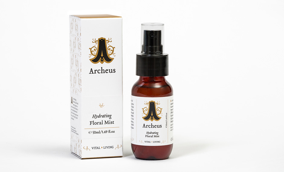
The Archeus brand is imbued with the the vitality of Nature. It’s tagline – vital living, extends on the meaning already present in the name. The visual identity is centred around the Archeus monogram, inspired by the owner’s favourite flower – the bluebell. Drawn from old hand drawn monograms the logo links back to ancient wisdom. Aesthetically the brand combines minimalism with luxury to produce a design which does only what it needs to, leaving the products natural beauty to do the rest.
We congratulate Georgina for bravely living her dream … and our skin thanks her for giving us such amazing product to use.
What can we say. Just try it www.archeus.co.nz
