Waferbites – A Brand Story Back
VISION:
Position Waferbites as a delicious treat for a sophisticated but waistline conscious audience, keeping a keen eye on the US market
PATH:
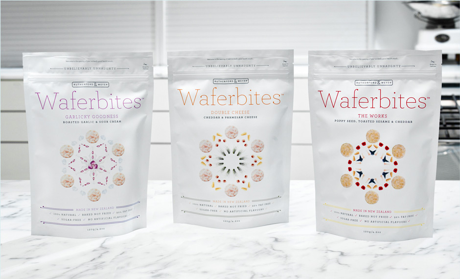
The team at Rutherford and Meyer came to us with a new product they had cooking at Taste H.Q. They had seen a growing market for healthy snack products that didn’t compromise on flavour. Waferbites was their response. Developed with a firm focus on getting a sophisticated, but health conscious demographic smitten, our challenge was to create a brand and packaging solution for them that would communicate three key propositions: healthy natural ingredients and production methods; huge mouth-watering flavours; and an upmarket sophistication that didn’t employ the usual brown paper ‘health’ product cues.
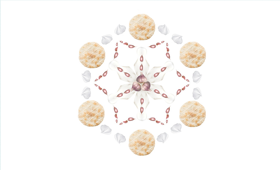
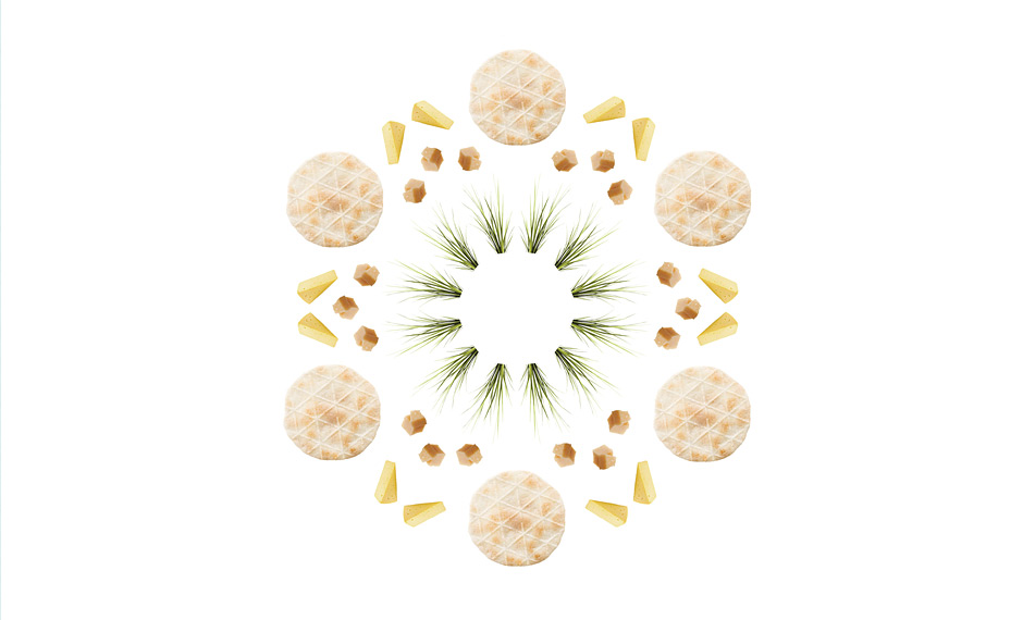
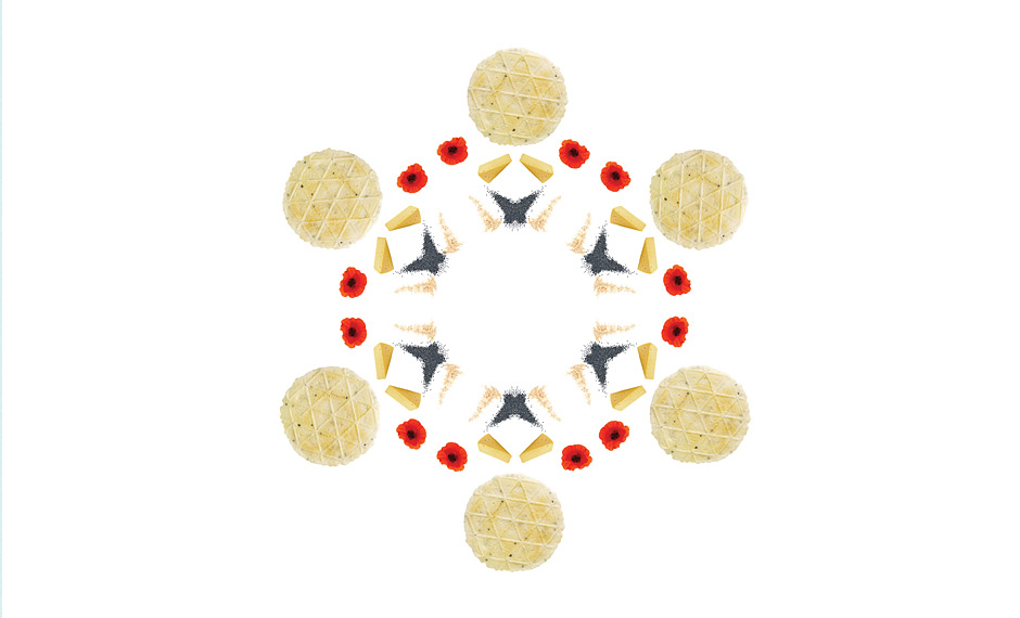
We started by creating a ‘snacker profile’. Who would buy Waferbites, what motivated them, and what did they look for on the shelf? Our creative response was a kaleidoscope of visual flavours, personality and production techniques. Packaging became deliberately minimal, tactile and organic so that it stood out in the cluttered, busy snack section of the local supermarket. We added a sprinkle of quirky personality and a large helping of clear and honest articulation of the health properties, and the Waferbites packaging was ready to serve.
OUTCOME:
With a distinctly individual personality, Waferbites hit the shelves of multiple New Zealand retailers and straight away stood out from the crowd. The US market also took notice with the product quickly opening new doors and attracting distributors across the country.
OUR PART:
Brand Development, Visual ID, Copywriting, Packaging.
